





Scrollable Component is a custom element (Web Component) designed to provide custom scrollbars while preserving native scrolling behavior. Instead of trying to mimic or override the viewport's native scrolling, it uses the viewport's native scrolling to drive custom scrollbar visuals.
<scrollable-component> ... </scrollable-component>- Demo
- Installation
- Usage
- Configuration
- Customized appearance
- Why use Scrollable Component?
- Browser compatibility
- How it works
You can check out some examples here.
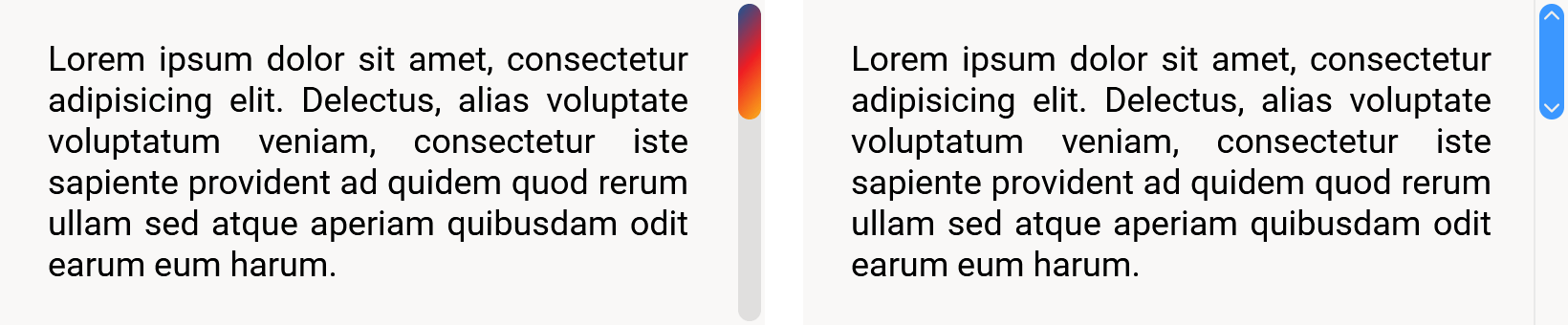
And here is a screenshot of a native scrollbar vs the default scrollbar provided by Scrollable Component:

npm install scrollable-componentThis package is ESM-only. The recommended way to use it is with a bundler (e.g. webpack, esbuild, ...), which handles module resolution for you.
Define the component:
import { defineScrollableComponent } from 'scrollable-component';
defineScrollableComponent();
Then use it in your HTML:
<scrollable-component>
  <!-- Your content -->
</scrollable-component>If you are not using a bundler, you'll need to expose the /node_modules/scrollable-component/index.js file so it is accessible from the web, then import it in your HTML using a module script.
The simplest approach is to import the file directly:
<script type="module">
  import { defineScrollableComponent } from '/node_modules/scrollable-component/index.js';
  defineScrollableComponent();
</script>
However, if you plan to re-use or share the component in other modules, I recommend using an Import Map, so that you can directly import the package using its name, just as you would with a bundler:
<script type="importmap">
  {
    "imports": {
      "scrollable-component": "/node_modules/scrollable-component/index.js"
    }
  }
</script>

<script type="module">
  import { defineScrollableComponent } from 'scrollable-component';
  defineScrollableComponent();
</script>
Then use the component in your HTML:
<scrollable-component>
  <!-- Your content -->
</scrollable-component>The ScrollableComponentElement will automatically add custom scrollbars if the content overflows the height/width of the viewport, so you just have to constrain its size (using height, max-height, or whatever you want):
<style>
  .my-content {
    height: 300px;
  }
</style>

<scrollable-component class="my-content">
  <!-- Your content -->
</scrollable-component>
Also, by default, the viewport's content will overflow in both directions, so if you have some content you don't want to overflow, you can override this just like you would with plain CSS:
/* Disable horizontal scrolling */
.my-content {
  overflow-x: hidden;
}

/* Disable vertical scrolling  */
.my-content {
  overflow-y: hidden;
}By default, the scrollbars only appear when hovering the viewport.
You can override this behavior by setting the scrollbar-visibility attribute.
Supported values are:
auto: scrollbars are only shown when hovering the viewport (this is the default value)never: scrollbars are never shownalways: scrollbars are always showntrackbar: scrollbars are always shown but their thumbs are only shown when hovering the viewport
<scrollable-component scrollbar-visibility="always">
  <!-- Your content -->
</scrollable-component>By default, the vertical scrollbar will appear on the right of the viewport, while the horizontal scrollbar will appear at the bottom of the viewport.
You can change this behavior by setting the vertical-scrollbar-position & horizontal-scrollbar-position attributes.
Supported values for vertical-scrollbar-position are:
right: vertical scrollbar is shown on the right (this is the default value)left: vertical scrollbar is shown on the leftboth: vertical scrollbar is shown both on the left & right
Supported values for horizontal-scrollbar-position are:
bottom: horizontal scrollbar is shown at the bottom (this is the default value)top: horizontal scrollbar is shown at the topboth: horizontal scrollbar is shown both at the top & bottom
<scrollable-component
  vertical-scrollbar-position="left"
  horizontal-scrollbar-position="top"
>
  <!-- Your content -->
</scrollable-component>By default, the scrollbars are overlaid on top of the content.
This is often the desired behavior when we implement custom scrollbars, as we don't want the spacing around the content to be unbalanced by the presence or absence of scrollbars, and allows for more unobtrusive scrollbars.
But if you prefer the scrollbars to take up space next to your content instead of overlaying them, you can disable the overlay behavior by setting the scrollbar-overlay attribute to false.
Supported values are:
true: scrollbars are overlaid on top of the content (this is the default value)false: scrollbars take up space next to your content
<scrollable-component scrollbar-overlay="false">
  <!-- Your content -->
</scrollable-component>If you want to know when the viewport is fully scrolled to one end or another, you can enable edge detection by setting the edge-detection attribute to true.
Supported values are:
false: edge detection is disabled (this is the default value)true: edge detection is enabled
<scrollable-component edge-detection="true">
  <!-- Your content -->
</scrollable-component>
When edge detection is enabled, some attributes will be toggled on & off on the component itself, so you can use CSS selectors to change the look of the component depending on them:
- when
top-overflowis present, the viewport isn't fully scrolled up - when
bottom-overflowis present, the viewport isn't fully scrolled down - when
left-overflowis present, the viewport isn't fully scrolled left - when
right-overflowis present, the viewport isn't fully scrolled right
For example, you could decide to display a top & bottom shadow to indicate to the user that they haven't fully scrolled the content yet:
scrollable-component {
  box-shadow:
    0 0 10px -12px rgba(0, 0, 0, 0) inset, /* hidden top shadow */
    0 0 10px -12px rgba(0, 0, 0, 0) inset; /* hidden bottom shadow */
  transition: box-shadow 200ms ease-in;
}
scrollable-component[top-overflow] {
  box-shadow:
    0 14px 10px -12px rgba(0, 0, 0, 0.6) inset, /* visible top shadow */
    0 0 10px -12px rgba(0, 0, 0, 0) inset;      /* hidden bottom shadow */
}
scrollable-component[bottom-overflow] {
  box-shadow:
    0 0 10px -12px rgba(0, 0, 0, 0) inset,       /* hidden top shadow */
    0 -14px 10px -12px rgba(0, 0, 0, 0.6) inset; /* visible bottom shadow */
}
scrollable-component[top-overflow][bottom-overflow] {
  box-shadow:
    0 14px 10px -12px rgba(0, 0, 0, 0.6) inset,  /* visible top shadow */
    0 -14px 10px -12px rgba(0, 0, 0, 0.6) inset; /* visible bottom shadow */
}If you don't like the default <scrollable-component> tag, you can override it by calling window.customElements.define() instead of calling defineScrollableComponent():
import { ScrollableComponentElement } from 'scrollable-component';
window.customElements.define('my-custom-tag', ScrollableComponentElement);
And then use it like this:
<my-custom-tag>
  <!-- Your content -->
</my-custom-tag>You can change the look & feel of the scrollbars using CSS.
Although you can fully customize every part of the component using plain CSS, it may sometimes be easier to override the provided CSS properties first.
Here is the list of all the default CSS properties you can override:
scrollable-component {
  /* Transitions */
  --fade-in-transition-duration: 150ms;
  --fade-out-transition-duration: 800ms;
  --fade-out-transition-delay: 300ms;
  --fill-color-transition-duration: 150ms;

  /* Scrollbar sizing */
  --scrollbar-width: 16px;
  --scrollbar-padding: 2px;

  /* Scrollbar's track color */
  --scrollbar-track-fill-color: transparent;
  --scrollbar-track-fill-color-hover: var(--scrollbar-track-fill-color);

  /* Scrollbar's thumb color */
  --scrollbar-thumb-fill-color: #ccc;
  --scrollbar-thumb-fill-color-hover: #aaa;
  --scrollbar-thumb-fill-color-active: var(--scrollbar-thumb-fill-color-hover);

  /* Content & scrollbar overlaying */
  --content-z-index: 0;
  --scrollbar-z-index: 10;
  --scrollbar-z-index-hover: 20;

  /* Content padding */
  /* Use this instead of setting the padding directly on the component */
  --content-padding: 0;
}If you need more control over the look of each part of the scrollbars, you can use CSS ::part() selectors to directly target the elements you want, and then use plain CSS to fully customize it.
Scrollable Component exposes the following part selectors:
contentto target the viewport's contentcontent-wrapperto target the wrapper around the viewport's contentscrollbarto target the container of each scrollbarscrollbar-trackto target the track of each scrollbarscrollbar-thumbto target the thumb of each scrollbar
In addition, you can combine the previous scrollbar* part selectors with the following ones:
vertical: to target left & right partshorizontal: to target top & bottom partsleft: to target left partsright: to target right partstop: to target top partsbottom: to target bottom parts
Here are some examples:
/* Target all scrollbars */
scrollable-component::part(scrollbar) {
  background-color: #fff;
}

/* Target top scrollbar */
scrollable-component::part(top scrollbar) {
  background-color: #000;
}

/* Target horizontal scrollbar tracks */
scrollable-component::part(horizontal scrollbar-track) {
  border: 1px solid #f00;
}

/* Target left scrollbar thumb */
scrollable-component::part(left scrollbar-thumb) {
  border: 1px solid #ccc;
}

/* Target hovered left scrollbar thumb */
scrollable-component::part(left scrollbar-thumb):hover {
  border-color: #00f;
}
Finally, you can use the special active part, to target active scrollbar thumbs (when the user is actively dragging them):
/* Target active scrollbar thumbs */
scrollable-component::part(active scrollbar-thumb) {
  outline: 1px solid #f00;
}Each scrollable-component is defining its own --viewport-width & --viewport-height CSS properties, which may be useful if you want to create something like a carousel, where child elements are sized proportionally to the viewport.
<style>
  .carousel .carousel-track {
    display: grid;
    grid-auto-flow: column;
    grid-gap: 30px;
  }
  .carousel .carousel-item {
    width: var(--viewport-width);
    height: 300px;
  }
</style>

<scrollable-component class="carousel">
  <div class="carousel-track">
    <div class="carousel-item">Slide 1</div>
    <div class="carousel-item">Slide 2</div>
    <div class="carousel-item">Slide 3</div>
    <div class="carousel-item">Slide 4</div>
    <div class="carousel-item">Slide 5</div>
    <div class="carousel-item">Slide 6</div>
  </div>
</scrollable-component>Simple, performant, modern, and customizable - Scrollable Component outperforms many older custom scrollbar packages.
- It's built for raw performance using modern browser features, which also allow for better customization & cleaner code
- It does not override the viewport's native behaviors (Mouse wheel scrolling, swipe scrolling, page down/up keys, arrow keys, middle mouse button's auto-scrolling, scroll snapping, JavaScript API...)
- It uses the Web Component standards, making it act like a black box from the outside (encapsulating HTML, CSS & JS) and leaving the DOM untouched, without extraneous
<div>elements - It's simple to use (you just need to add the
<scrollable-component>tag around the content you want the custom scrollbars on) - It's easy to customize and highly customizable
This package is not intended to replace all the scrollbars of your website, especially not the body's scrollbar. Tampering with native behaviors always carries risk, especially for accessibility.
It's recommended to only use it sparingly, on small parts of your website (like dialogs, chats, sidebars, dropdowns...) to enhance the user's experience through a cleaner UI.
- It will never be as fast as native scrollbars
- It doesn't support right-to-left and vertical writing mode
- It sacrifices some native features (e.g. Google Chrome's search result highlights in the scrollbar)
- Some native features might not work quite as expected (e.g. scroll snapping isn't smooth when using the custom scrollbars instead of the viewport)
- The custom scrollbars are simple divs that are absolutely positioned above the native viewport, which means scrolling using the custom scrollbars instead of the viewport is, in fact, handled with some javascript and not natively
Every modern browser that supports the following features:
- shadow dom
- custom elements
- javascript resize observer
- javascript private class fields
- css sticky position
- css scrollbar width
- css custom properties
- css part selector
So, basically, all up-to-date browsers since 2025.
Scrollable Component uses the Web Component standards to create a custom element which handles all the work for you and can even be extended.
The native scrollbars are hidden using the CSS scrollbar-width: none rule.
The custom scrollbars are placed using a combination of the CSS position: sticky & position: absolute rules.
The custom scrollbars are redrawn when needed, to visually match where the native scrollbars would be placed.
All scrolling behaviors when interacting on the viewport itself are still the native ones.
Scrolling behaviors when using the custom scrollbar (i.e. dragging the scrollbar's thumb or clicking somewhere on the scrollbar's track) are handled with some JavaScript which then natively moves the viewport's scroll position.